RuPaul’s Drag Race - RuColor Case Study

Player Motivation & Challenges
Players lacked motivation and reason to utilize older Drag Pieces.
Since launch, players had been requesting the ability to RuColor (recolor) Drag Pieces. Many had hundreds of Drag Pieces in their wardrobe that were rarely used in Challenges. With the introduction of themed challenges (non-scoring challenges) in Toot & Boot, we found that players were more willing to try older pieces that would otherwise be ignored in scored challenges.
The wardrobe had already undergone a large UI overhaul to improve Drag Piece detail management. However, with Star Styling and RuColors being introduced afterward, it became important to condense multiple layers of information and utility into one small panel—while keeping the dress-up flow familiar and ensuring everything could still be done in one place.

Player Flow - Do I want to change the colour of this Drag Piece?


Market Research & References
I looked at Love Nikki and Dress Up Time Princess as primary competitors in the fashion dress-up genre (Infinity Nikki had not yet been released).
Love Nikki: The UI was extremely cluttered due to layered features, and its dye system was buried within that UI. This posed a scalability issue we wanted to avoid. Love Nikki also monetized through dye packs, which was a path we planned to adopt as well.
Dress Up Time Princess: Featured advanced customization, letting players change color and pattern (restricted to certain areas). This was our main point of reference. However, due to scope and technical limitations, we stripped this down to simple color changes applied to the entire Drag Piece.
As with most features in RuPaul, the main design challenge wasn’t monetization, but rather how to pack more information into a small panel without breaking the flow.
Medium Fidelity Mock-ups

Iteration 1 - Overlays
Early design and tech limitations led me to reorganize the Drag Piece card overlay. Borrowing a toggle interaction from Idle gameplay, I assumed players would recognize and understand it. This design was never tested—and fortunately never released. Midway through development, a wardrobe update introduced a details panel sliding in from the right, replacing overlays. This change later influenced Star Styling and RuColor.

Iteration 2 - Outfit Alterations
Internally, we saw players often equip an outfit first, then fine-tune it on another screen. This led to an “Alter” button placed below the Store (on the left). Entering Alteration Mode allowed players to adjust Star Style and colors.

Iteration 3 - Outfit Alterations Tuning
Having the Alter button directly beneath the Store competed for player attention. Since pulling focus from the Store was risky, we moved the button down toward the score. To improve orientation in Alteration Mode, we shifted the color bar to the bottom. Players could still edit equipped items on one screen, but this revealed a pain point.

Iteration 4 - Pain Point identified
The equip-first flow only worked well for challenges. Playtests showed that players wanting to quickly swap outfits had to bounce between modes too often. Similarly, players browsing their collection had to equip a piece before editing it, which felt slow.
The solution: allow direct edits of individual pieces. Tapping the (?) button on each card opened details, with RuColor integrated into a new tab at the top of the panel. Star Styling was also added as a separate tab.

Iteration 5 - Palettes
Originally, selectable colors were large blocks. Once we confirmed technical constraints, we introduced palettes showing base colors in different shades. All colors were previewable to enhance the “shopping” experience, but unlocking required currency (per palette, not per color—though I did consider that option).
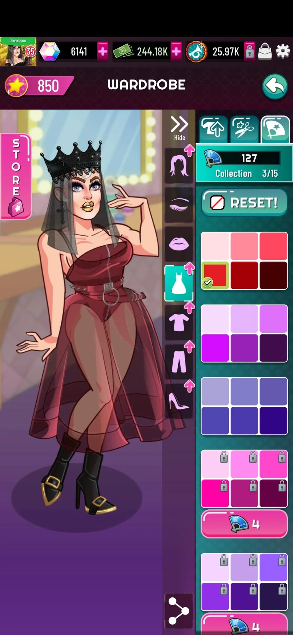
Design Decision - Final Version
Consolidating all dress-up features into a tab system proved intuitive. The wardrobe redesign paved the way to place Star Styling and RuColor in their own tabs, while keeping the core gameplay decluttered.
Since each rarity had its own RuColor currency, we included a small counter at the top. After release, some players didn’t know how to deselect a RuColor—despite it sharing the same interaction as deselecting a Drag Piece. To address this, we added a reset button to return pieces to their original color.
FINAL Thoughts
The feature was well-received: players expressed creativity through Reddit posts, and engagement in Toot & Boot challenges increased.
One improvement I’d make would be to allow scrolling through Drag Pieces within the inspection screen, instead of backing out and re-entering for each piece. Looking ahead, adding patterns or accessories could challenge the existing layout and may require expanding the panel to support more tabs.
A key learning came from interactions. I reused the familiar “tap to select, tap again to deselect” pattern, assuming players would connect the dots. But many didn’t. Despite tutorials explaining RuColor selection, players struggled, and we ultimately added a reset button—consuming valuable space.
This was a humbling reminder: never assume players will understand interactions based on context alone.