RuPaul’s Drag Race - Opponent Select Case Study
Player Motivation & Challenges
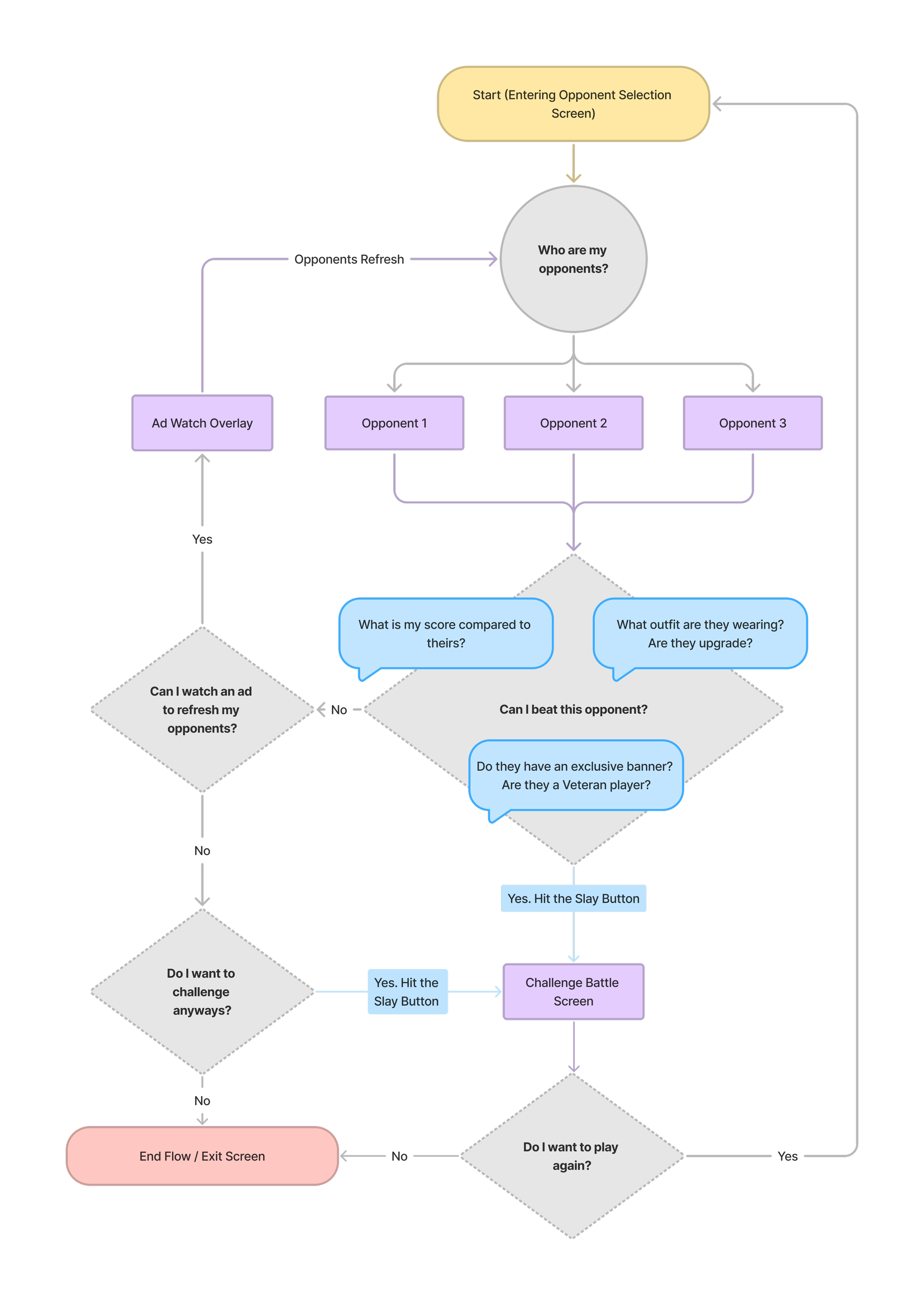
Players were frustrated with the inability to choose opponents.
At launch, players were automatically matched against others within the same “score.” This score was never shown to players and existed mainly to drive the matchmaking system in Unity. The system was generally skewed to let the player win most of the time. Interestingly, the inability to choose caused players to perceive losses as far more significant than anticipated.
The feature to select opponents challenged players’ knowledge of the Drag Piece catalogue and the star levels being displayed. Having the ability to choose also allowed players to feel more in control, perceiving a loss as their mistake rather than blaming the system. If players felt the available opponent selection wasn’t winnable, they could watch an ad to refresh the options.
The challenge with this feature was integrating various pieces of opponent information and presenting them in a quick, digestible, and meaningful way. Stakeholders also required that the screen generate some form of revenue.
Market Research & References
Not many fashion dress-up games included PvP gameplay (most were PvE). This pushed me to look outward, particularly at popular RPGs.
One major reference was Epic Seven, which provided a good model for digestible opponent information—comparing power level, character level, ranking, etc. These examples leaned toward being more informative and less thematic, which isn’t necessarily a bad thing, especially when the goal is to quickly funnel players through menus and into gameplay.
Nikke: Goddess of Victory was another reference, particularly for its player profile banner. This increased the value of banners since they were shown to other players. In many games, vanity items are rarely displayed, so players don’t feel incentivized to pursue or purchase them. In RuPaul, profile banners suffered from this same problem. They were awarded through leaderboards and season passes, but players rarely had a chance to show them off. Including banners in the Opponent Selection screen would increase their perceived value.
Finally, I looked at Destiny 2. While opponent selection doesn’t exist there (matchmaking is automatic), the display of opponents/teams after matching inspired me. Adding posing for opponents was a no-brainer.
Medium Fidelity Mock-ups

Iteration 1 - There were 3
Technical limitations dictated that we could only reveal three opponents at a time. This wasn’t necessarily a problem, since showing more could lead to decision paralysis. One of our goals was to streamline and shorten the challenge flow, especially because the opponent selection screen was an extra step being added.
This mock was quickly dismissed, however, as we were unable to display the lower half of the avatar—leaving players to judge solely by the top half and the Superstar Score.

Iteration 2A - Full Body
This version was a first step in the right direction. We now displayed the full body of both the opponent and the player’s outfit. Players would flip through two other opponent options. Vanity inclusions were not yet considered at this stage.
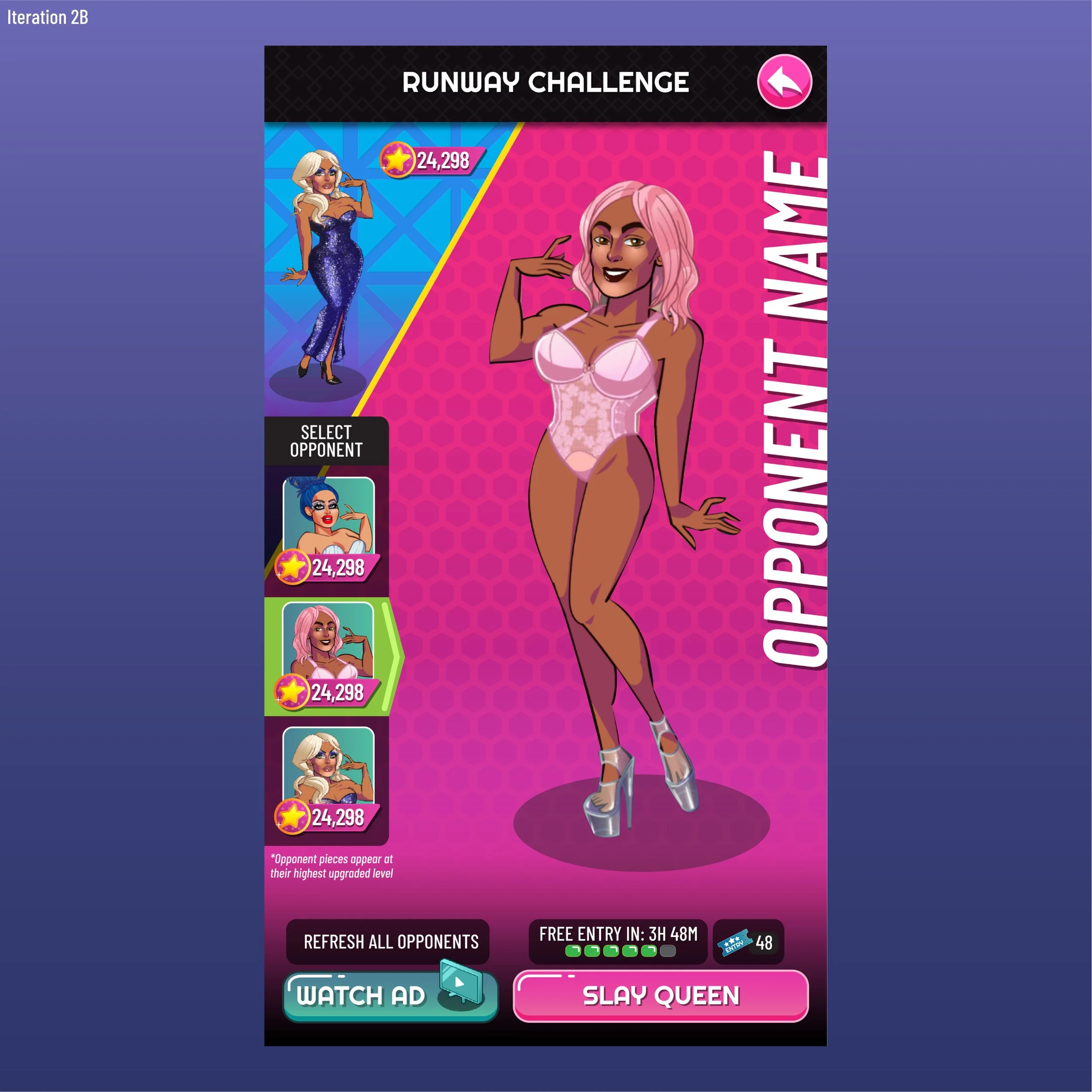
Iteration 2B - Opponent overview
We realized players couldn’t quickly scan through opponents. To help speed up the flow, we added a quick selection panel on the left-hand side. The player avatar was made smaller to put more emphasis on opponent selection.

Iteration 2C - Missing player Avatar
We went further and removed the player avatar entirely. This turned out to be a mistake, as players lost a reference point for how their outfit compared. We hoped they would remember their challenge outfit from the previous screen, but during repeated challenge flows, many forgot.
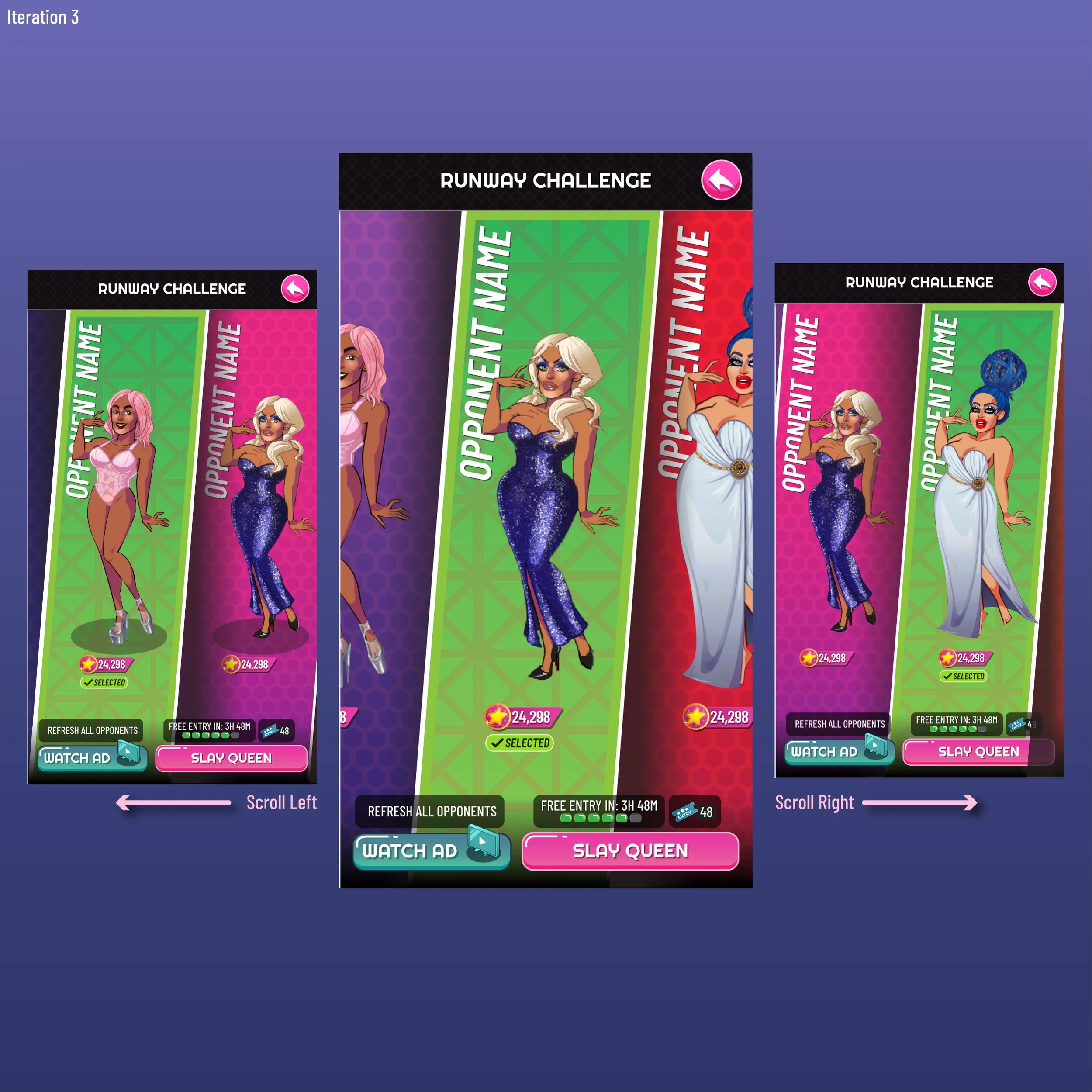
Iteration 3 - Radical Interactions
Here, we tried a completely different approach: a scroll/swipe interaction, similar to Tinder, to show opponents full-sized. The idea was that the familiar swipe pattern might feel intuitive. These mocks didn’t include all previous findings—they were mainly to get the concept across during design meetings.
While seeing all three avatars was appreciated, the swipe interaction was questionable. As the first of its kind (outside of standard scrolling), it posed a usability risk. Around this stage, we also drew inspiration from Destiny 2’s thematic team line-up displays.

Iteration 4 - Werk the Runway
After positive feedback on seeing all three avatars at once, I mocked up this version where all three appeared together. A rotating carousel was needed, but this generated the most excitement internally, and the technical expense was waived. (The expense wasn’t the carousel itself, but pulling and generating three avatars simultaneously.)
I also proposed including banners and shade lines, and continued iterating on this version.
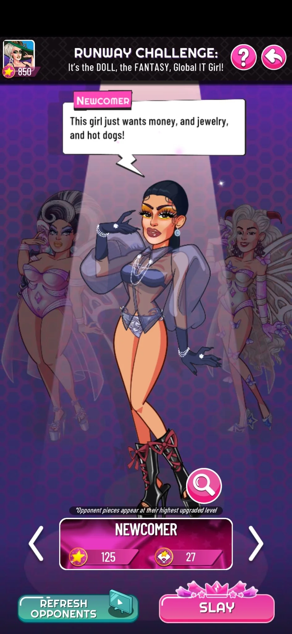
Design Decision - Final Version
Let’s start from the top.
It was important that players always knew their Superstar Score—the accumulation of all Drag Pieces, item levels, and Snatched Editions collected (essentially a power level). The avatar displayed was a headshot of the player’s challenge outfit, separate from their profile headshot.
With limited screen space, a headshot was enough to remind players what they wore for the upcoming challenge. This reminder was reinforced once the challenge began, especially useful during multi-challenge flows.
As mentioned above, whenever we had the chance to show off vanity items, we did. Using the extra space above the avatar’s head to display opponent shade lines added flair to the experience.
Opponent avatars always displayed at their highest upgraded level. This was critical, as the recently introduced Star Styling (Transmog) could otherwise cause confusion—showing drag pieces in a styled form while base scores didn’t match. Players could select opponents using a rotating carousel.
Profile banners included additional information summarizing the opponent’s career. Displaying Superstar Score and Snatched Edition Score helped newer players make informed choices, even if they lacked catalogue knowledge. For veteran players, these metrics weren’t always reliable, since their vast wardrobes didn’t necessarily reflect the strength of their current outfit—the true test came from knowledge of upgraded pieces.
Monetization opportunities
On-screen: Opponents included an inspect overlay (magnifying glass), allowing players to purchase certain outfits opponents were wearing (with limitations on makeup and lips). Refreshing opponents required watching ads (up to a set maximum), and when tickets ran out, the Slay button charged gems.
Off-screen: Vanity items gained value through greater visibility. Players began chasing shade lines and profile banners in leaderboards and season passes once they were integrated into this screen.
FINAL Thoughts
Although the added interaction of selecting opponents slightly slowed the flow, it significantly enhanced player experience. It became a micro-mini-game where knowledge was tested, making PvP feel more authentic. Wins felt more impactful, and losses less frustrating.
As shown in the mock-ups, simpler, more informative versions of Opponent Select were possible—but they wouldn’t have produced the same experience. One improvement I’d consider is integrating banners into the background rather than a container at the bottom. Flipping through opponents would cause respective banners to fade in and out, freeing space for larger avatars.
This screen also has potential to showcase even more vanity items, such as pets, poses, and effects. Including banners and shade lines here reinforced an important realization: not every screen has to directly ask for money. By displaying vanity items prominently, their perceived value increases, which in turn boosts monetization across other parts of the game. This insight shaped the way I approached future features.